Project Overview
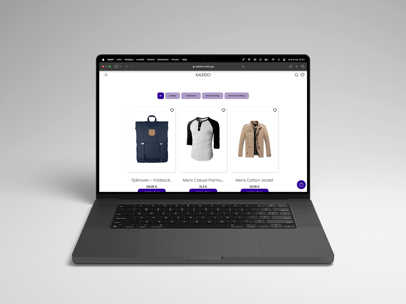
Kaleido is a responsive e-commerce application focused on delivering a smooth and intuitive shopping experience across devices. The project explored how modern component-based architecture could support scalable frontend development while maintaining strong usability.
The Problem
E-commerce platforms often struggle with complex navigation and overwhelming product pages. Users can easily lose track of where they are in the shopping process or become frustrated with slow interactions.
Key Insight
Users value clarity and speed during online shopping. If navigation is intuitive and the checkout process is predictable, customers are far more likely to complete purchases.
Why It Matters
E-commerce is one of the clearest examples of how design directly affects business outcomes. A confusing product page, an inconsistent checkout flow, a slow-loading grid: each of these has a measurable effect on whether users complete a purchase. A clean, predictable interface removes the friction that causes people to leave, and replaces it with a shopping experience they are willing to return to.
Target Audience
The platform targets everyday online shoppers looking for a clean and intuitive browsing experience across desktop and mobile devices.
- Users browsing products on mobile devices
- Customers who expect fast loading pages
- Users who prefer simple checkout processes
- Online shoppers comparing multiple products
Design Approach
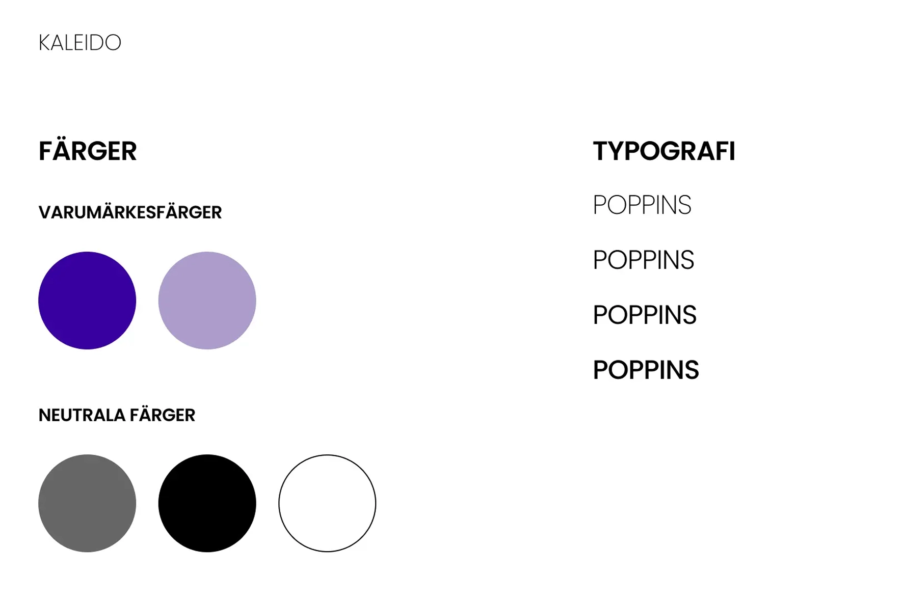
The project began with moodboards and low-fidelity wireframes before moving into high-fidelity interface design in Figma. The frontend was implemented using a component-based React architecture to ensure maintainability and scalability.
The Solution
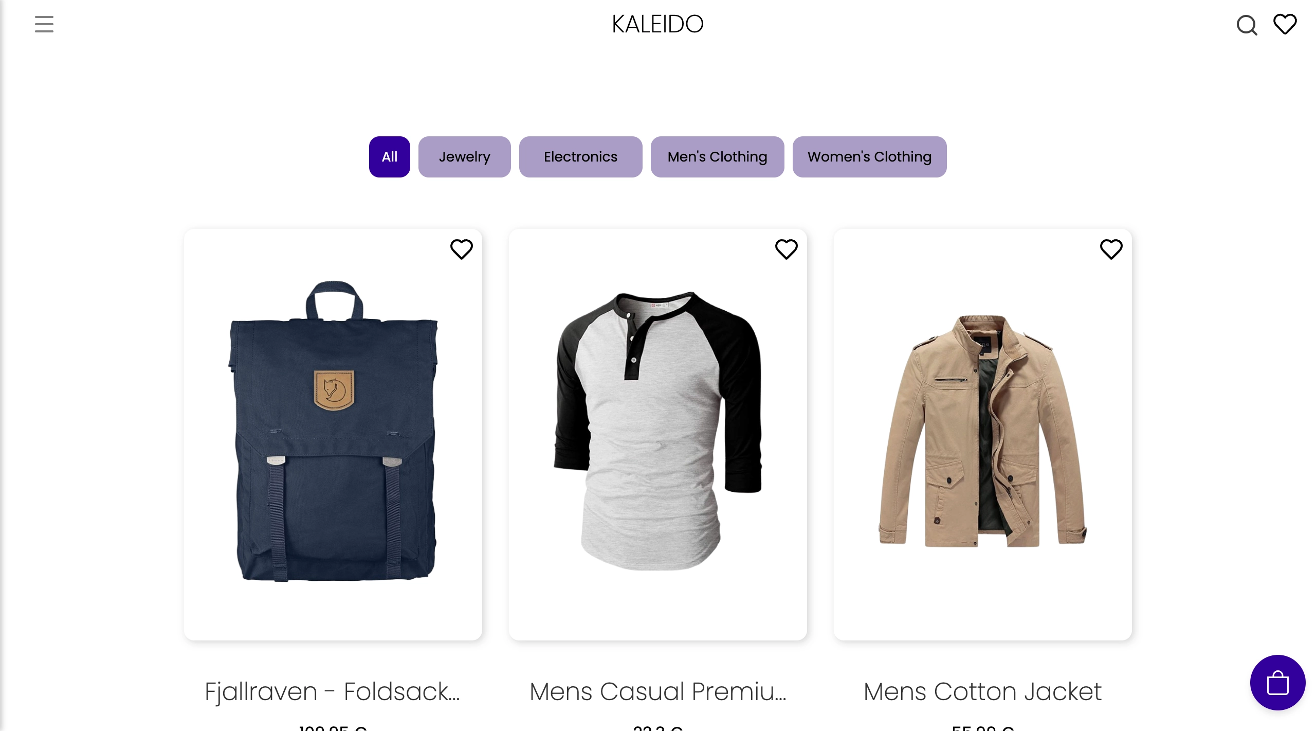
The final interface focuses on clarity, product visibility and a frictionless shopping flow. The layout prioritizes product discovery by presenting items in a clean grid with clear categories and visual hierarchy. Users can quickly browse products, filter by category and add items to their cart without interrupting the browsing experience. The checkout process is designed as a clear step-by-step flow, helping users stay oriented and complete their purchase with minimal effort. By simplifying navigation and reducing unnecessary complexity, the interface creates a smoother and more intuitive shopping experience across both desktop and mobile devices.
Feature Walkthrough
Responsive Product Grid
Products are displayed in a flexible grid that adapts seamlessly across screen sizes.
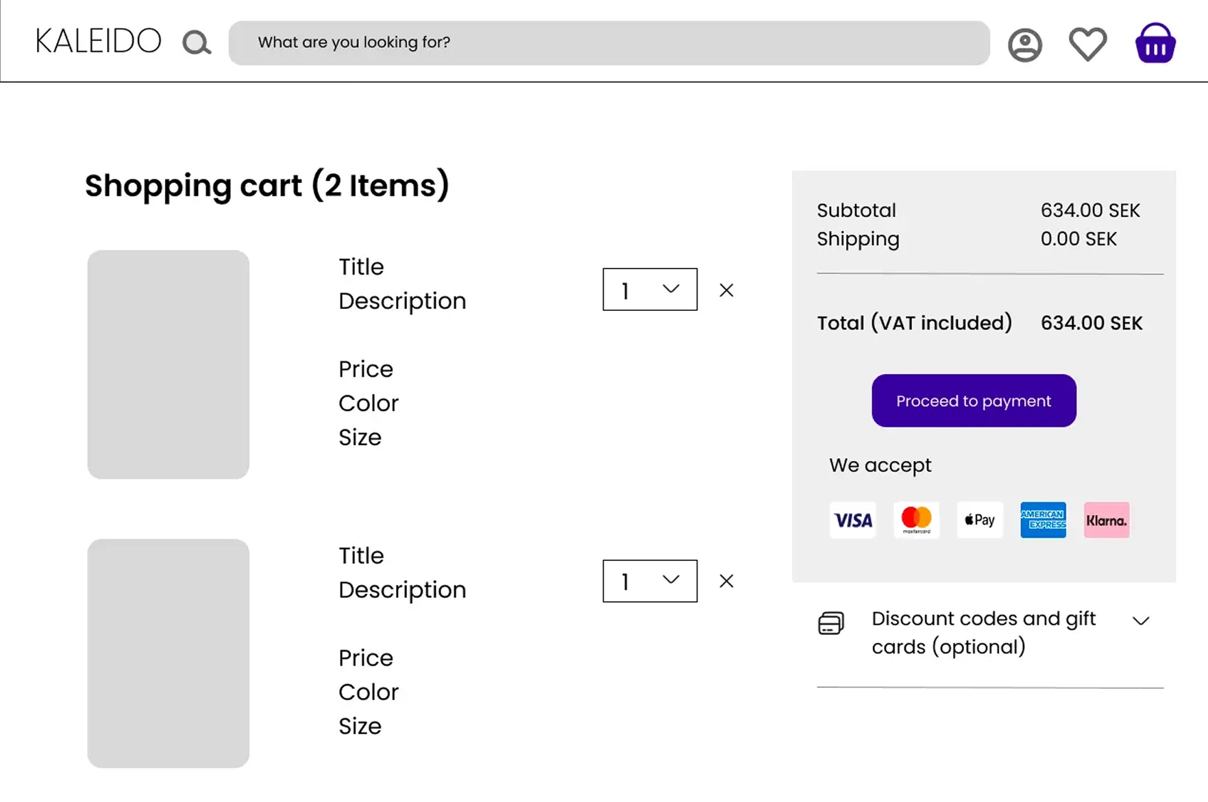
Dynamic Cart
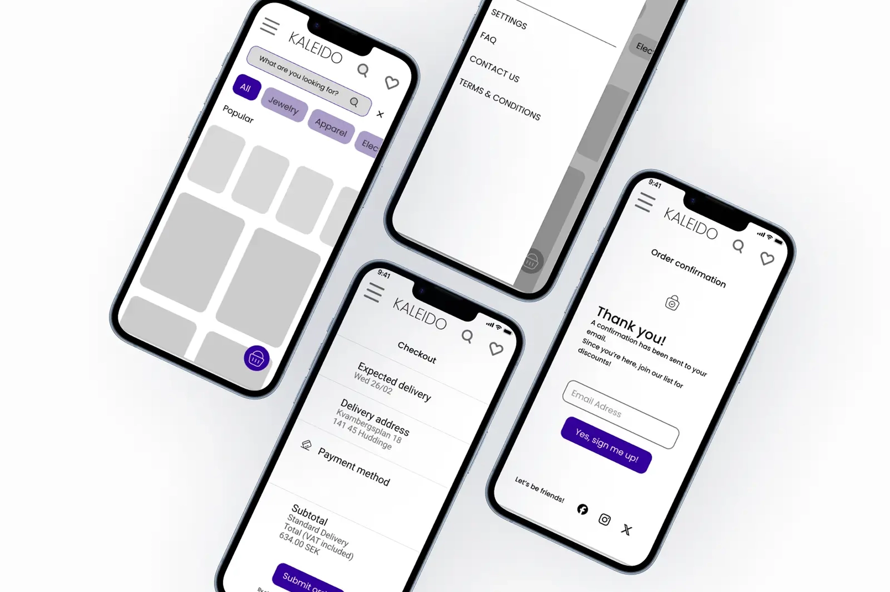
Users can add products to their cart and instantly see updates without refreshing the page.
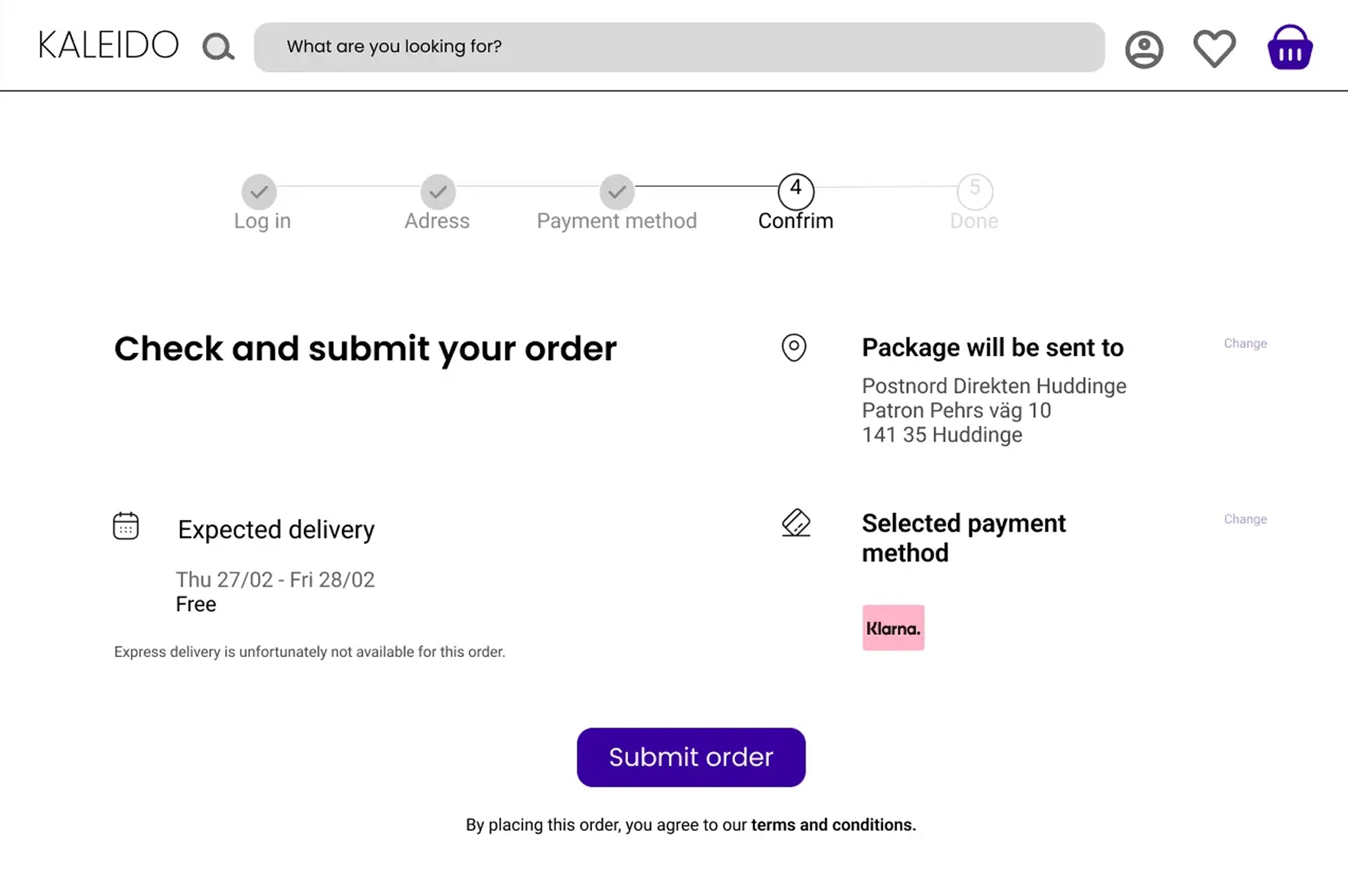
Structured Checkout
The checkout process is designed to minimize friction and guide users step-by-step toward completing their purchase.
Impact
The final application delivers a modern e-commerce experience with responsive design, clear product presentation and smooth interactions.
Reflection & Learnings
This project highlighted the importance of aligning design and development. Building reusable components made the interface easier to maintain while improving development speed.